- Category
- Knowledge Base
Date12 June 2026
Date9 April 2026
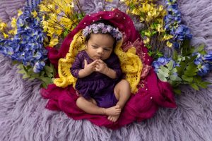
If you’ve spent any time scrolling through Pinterest or Instagram, you’ve definitely seen the light and airy photography style—those soft, glowing images that feel almost weightless. But what actually makes a photo “light and airy”? It’s not just about brightness. It’s about balance, softness, and intentional simplicity.
At its core, this style is defined by high exposure, soft shadows, low contrast, and a clean color palette. Whites look crisp but not blown out, skin tones appear natural and luminous, and the overall image feels open and breathable. There’s a sense of calm built into every frame, like a quiet spring morning where everything feels fresh and new.
Another key element is the absence of visual clutter. Light and airy photography thrives on minimalism. Instead of filling the frame with props, the focus stays on the subject, supported by subtle textures and soft backgrounds. This creates a timeless look that doesn’t feel tied to any specific trend.
From an SEO perspective, this style aligns with popular keywords like bright and airy photography, soft light portraits, and clean aesthetic photography, all of which are widely searched by photographers and clients alike.
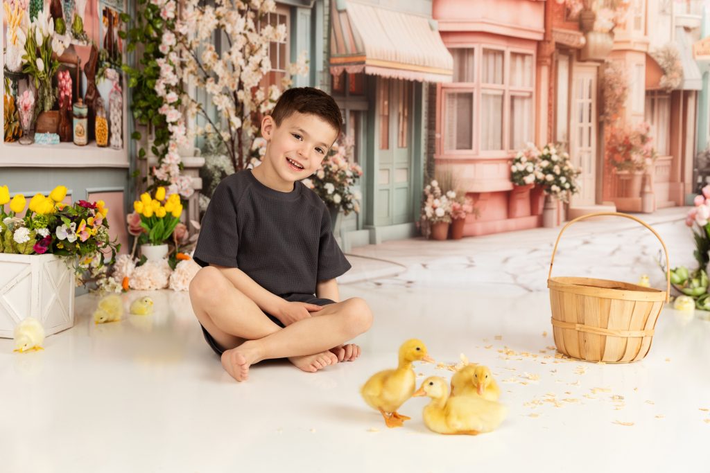
Spring is all about renewal, light, and softness—so it naturally pairs with the light and airy photography style. Think about how spring feels: longer days, softer sunlight, lighter clothing, and a general sense of ease. This aesthetic captures all of that without needing obvious seasonal props like flowers.
The beauty of this approach is that it suggests spring rather than shouting it. You don’t need blooming trees or colorful gardens to communicate the season. Instead, you use light, color, and mood to create that same emotional response.
Families and clients are especially drawn to this style in spring because it feels fresh yet timeless. It works for everything from family portraits to maternity shoots and personal branding sessions. And because it avoids heavy trends, the images age gracefully.
Photographers often report higher client satisfaction with this style because it flatters everyone. Soft lighting reduces harsh shadows, bright tones enhance skin, and the overall effect feels natural rather than overly edited. It’s one of those rare styles that looks effortless—even though it requires careful planning.
Lighting is the foundation of any light and airy studio photography setup. If your lighting isn’t right, no amount of editing can fully fix it. The goal is to replicate soft, natural daylight—the kind that gently wraps around your subject.
If your studio has access to large windows, you’re already halfway there. Natural light is ideal because it’s inherently soft and dynamic. Position your subject near the window, use sheer curtains to diffuse harsh sunlight, and you’ll get that signature glow almost instantly.
But what if you don’t have good natural light? That’s where artificial lighting comes in. Modern studio equipment makes it possible to mimic daylight incredibly well. Large softboxes, umbrella lights, and diffusers can all help create that same soft, even illumination.
The key is to avoid direct, harsh light. You want your light source to be large and diffused, which softens shadows and creates a more flattering look. Many photographers place their light at a 45-degree angle to the subject, which adds just enough depth without creating strong contrast.
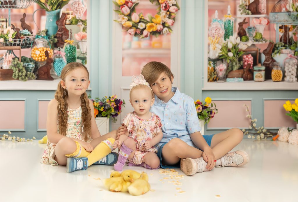
Angle matters just as much as intensity. Even the best light can look unflattering if it’s positioned incorrectly. For a bright and airy look, you want soft, subtle shadows that add dimension without overpowering the image.
Side lighting is a popular choice because it creates gentle contours on the face and body. It adds depth while still maintaining that soft, open feel. Front lighting, on the other hand, reduces shadows almost completely, resulting in a very clean and polished look.
Backlighting can also be used creatively. When done right, it creates a soft halo effect around the subject, enhancing that dreamy, spring-like atmosphere. Just be careful with exposure—backlighting can easily lead to blown-out highlights if not controlled properly.
A good rule of thumb? Always test and adjust. Small changes in light position can make a huge difference in the final image.
Your background plays a bigger role than you might think. In light and airy studio photography, the backdrop sets the tone for the entire image. The goal is to keep it bright, simple, and non-distracting.
White, cream, beige, and soft gray are all excellent choices. These colors reflect light rather than absorbing it, which helps maintain that bright, open feel. They also complement a wide range of skin tones and wardrobe choices.
Seamless paper backdrops are a popular option because they create a clean, uninterrupted look. Painted canvas or lightly textured walls can also work beautifully if you want a bit more character without adding clutter.
While simplicity is key, a completely flat background can sometimes feel a bit lifeless. That’s where texture comes in. Subtle textures—like linen fabric, soft plaster, or lightly wrinkled muslin—can add depth without distracting from the subject.
The trick is to keep it understated. You want the texture to be felt rather than seen. It should enhance the image, not compete with it.
Color is one of the easiest ways to instantly communicate a spring photography aesthetic, but here’s the trick—it needs to feel soft, not loud. When you’re aiming for a light and airy look in studio photography, your color palette should gently support the image rather than dominate it.
Soft pastels are your best friend here. Think dusty pinks, pale blues, sage greens, warm creams, and light lavender. These colors reflect light beautifully, helping to maintain that bright, glowing effect that defines this style. They also create a calming visual experience, which makes your photos feel more emotional and inviting.
But it’s not just about picking pastel colors—it’s about how you combine them. Instead of throwing multiple bright tones together, build a cohesive palette. For example, pairing cream with soft blue and a hint of beige creates a balanced, harmonious look. This approach is widely used in professional spring photoshoots because it keeps the focus on the subject while still adding visual interest.
Another advantage? These tones are incredibly flattering on camera. They reduce color cast on skin tones and work well with soft lighting setups. That’s why searches like spring photoshoot color palette and pastel outfit ideas for photos continue to trend—people are actively looking for this aesthetic.
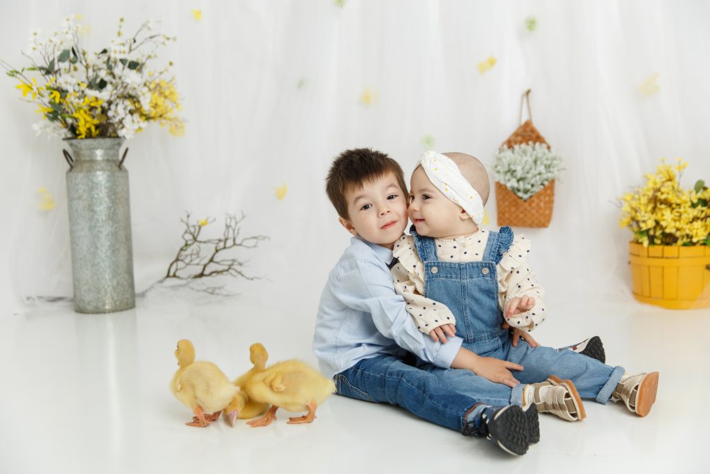
Now let’s talk about what not to do. Dark, saturated, or overly bold colors can completely break the light and airy illusion. Deep reds, heavy blacks, neon tones—these absorb light and introduce contrast that feels out of place in a spring-inspired setup.
That doesn’t mean you have to avoid contrast entirely. It just needs to be subtle. For example, a slightly darker beige or muted olive can add depth without overpowering the image. The goal is to maintain a soft visual flow where nothing feels too harsh or abrupt.
If you’re working with families or multiple subjects, this becomes even more important. One overly bold outfit can throw off the entire composition. That’s why many photographers guide clients with wardrobe mood boards or color suggestions ahead of time.
Wardrobe can make or break your light and airy studio photoshoot—seriously. Even with perfect lighting, the wrong fabric can absorb light and flatten your image. That’s why choosing the right materials is just as important as choosing the right colors.
Lightweight, breathable fabrics like linen, cotton, chiffon, and soft knits are ideal. These materials interact with light in a way that feels natural and soft. They create gentle highlights and subtle shadows, adding depth without harshness.
Flowy fabrics are especially effective because they introduce movement. Even a slight shift in posture can create a sense of motion, which enhances that dreamy, spring-like feel. This is why you’ll often see dresses, loose shirts, and layered outfits in spring family photography sessions.
On the flip side, avoid stiff or shiny materials. Satin and polyester can reflect light in unpredictable ways, sometimes creating glare or uneven highlights. Thick fabrics can also feel too heavy for the aesthetic you’re trying to achieve.
When photographing multiple people, coordination becomes key—but that doesn’t mean matching outfits. In fact, overly matching looks can feel outdated and take away from the natural vibe you’re going for.
Instead, think in terms of color harmony and texture balance. Choose a palette and let each person interpret it in their own way. One might wear a soft blue dress, another a cream sweater, and another light beige pants. Together, it creates a cohesive yet dynamic look.
Layering can also add interest. A cardigan, a scarf, or a light jacket can introduce subtle variation without disrupting the overall aesthetic. This is especially helpful in studio settings where the environment is more controlled.
Let’s get a bit technical—but keep it practical. To achieve that bright and airy photography look, your camera settings need to support your lighting and styling choices.
Start with exposure. You’ll typically want to slightly overexpose your image—but only a little. This helps create that bright, glowing effect without losing detail. Most photographers aim for a histogram that leans toward the right (the brighter side) without clipping highlights.
Aperture also plays a big role. A wider aperture (like f/1.8 to f/2.8) creates a shallow depth of field, which helps separate your subject from the background and adds that soft, dreamy blur. This is a signature element of the light and airy style.
ISO should be kept as low as possible to maintain image quality. Since you’re working with bright lighting, you usually won’t need to push it too high. Clean, noise-free images are essential for this aesthetic.
Here’s where a lot of people go wrong—they push brightness too far. While the goal is a light image, overexposure can lead to blown-out highlights, especially in white clothing or backgrounds.
To avoid this, keep an eye on your highlights while shooting. Use your camera’s highlight warning or histogram to make sure you’re not losing detail. It’s better to slightly underexpose and adjust in editing than to lose information completely.
Shooting in RAW format is also crucial. It gives you more flexibility in post-processing, allowing you to recover highlights and fine-tune exposure without degrading the image.
Editing is where everything comes together. Even with perfect shooting conditions, you’ll need to refine your image to achieve that polished light and airy photography style.
Start by adjusting the whites and highlights to brighten the image, but do it gradually. Then lift the shadows slightly to reduce contrast and create a softer look. The goal is to even out the tones without making the image feel flat.
Pay attention to color balance as well. Slightly warming up the image can enhance that spring feel, but avoid going too yellow. Subtlety is key.
Presets can be a great starting point, especially if you’re trying to maintain a consistent style across multiple sessions. Many photographers use light and airy Lightroom presets to speed up their workflow.
That said, presets aren’t magic. Every image is different, so you’ll still need to make adjustments. Think of presets as a base, not a final solution.
Manual editing gives you more control and helps you develop your own unique style. Over time, you’ll start to recognize patterns in your edits and create a workflow that feels natural.
It’s easy to get carried away with editing—especially when you’re chasing that bright, glowing look. But pushing things too far can result in flat, unrealistic images where all the detail is lost.
Skin can start to look plastic, textures disappear, and the image loses its depth. The key is restraint. A good edit enhances the photo—it doesn’t completely transform it.
Even the best editing can’t fix bad lighting. Uneven light, harsh shadows, or incorrect color temperature can make your images feel off, no matter how much you tweak them later.
That’s why getting your lighting right during the shoot is so important. Editing should be the finishing touch, not a rescue mission.
Minimalism doesn’t mean flat. Even in a simple setup, you can create depth by layering elements—foreground, subject, and background. Use subtle shadows, textures, and spacing to give your image dimension.
Bright images can sometimes feel a bit “perfect,” so emotion becomes even more important. Encourage interaction, look for genuine expressions, and focus on connection. That’s what turns a technically good photo into something memorable.
Creating a light and airy spring look in studio photography isn’t about following a strict formula—it’s about understanding how light, color, and emotion work together. When you get those elements right, everything else falls into place.
From soft lighting and neutral backdrops to thoughtful styling and careful editing, each step plays a role in building that final image. And when it all comes together, the result is something that feels effortless, timeless, and genuinely beautiful.