- Category
- Knowledge Base
Date12 June 2026
Date16 April 2026
Color isn’t just decoration—it’s storytelling. In studio photography, where every detail is controlled, color becomes one of the most powerful tools you have to influence how an image feels. Before someone notices the pose or composition, they feel the color. It sets the emotional tone instantly.
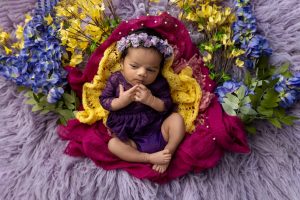
Soft, muted tones tend to create a calm, peaceful atmosphere. They feel intimate, gentle, and often a bit nostalgic. That’s why soft pastel photography is so popular for family sessions, maternity shoots, and anything centered around connection and emotion.
On the other hand, bold and saturated colors bring energy. They feel confident, modern, and expressive. A bright palette can turn a simple studio setup into something dynamic and eye-catching, which is why it’s often used in branding photography or creative portraits.
In 2026, photographers are becoming more intentional about color choices. Instead of defaulting to “what looks nice,” they’re asking, what story do I want this image to tell? That’s the real difference between an average photo and one that resonates.
Spring is naturally associated with color—but in a studio, you don’t have real-world cues like blooming trees or green landscapes. That means your color palette has to do all the work.
This is where the decision between soft pastels vs bright colors becomes critical. Your palette defines the entire mood of the shoot. Without it, the image can feel flat or directionless.
Studio environments amplify color. Controlled lighting, neutral backdrops, and minimal distractions mean that every hue stands out more. A soft pink might look subtle outdoors, but in a studio, it becomes a defining element. Likewise, a bright red or yellow can dominate the frame if not carefully balanced.
That’s why choosing the right palette isn’t just about preference—it’s about intention.
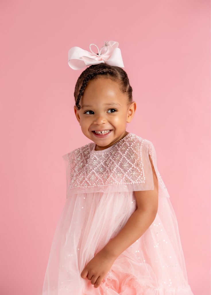
Soft pastels are essentially lighter, desaturated versions of traditional colors. Think blush pink instead of hot pink, powder blue instead of royal blue, or sage green instead of emerald. These tones are often described as “washed” or “muted,” but in a good way—they feel soft and approachable.
In spring studio photography, pastels are almost a go-to choice because they naturally align with the season’s aesthetic. They suggest freshness, lightness, and simplicity without feeling overwhelming.
What makes pastels unique is their ability to blend seamlessly. Instead of competing for attention, they work together to create a cohesive, harmonious look. That’s especially important in studio sessions where multiple elements—wardrobe, backdrop, lighting—need to feel connected.
There’s a technical reason why pastels are so popular: they’re incredibly camera-friendly. Soft tones reflect light rather than absorb it, which helps maintain a bright and even exposure.
They also reduce the risk of color cast. For example, a bright red outfit might reflect onto the skin, creating unwanted tones. Pastels, being more subtle, don’t cause this issue as much.
Another advantage is how forgiving they are in editing. You can adjust brightness, contrast, and white balance without drastically altering the color. This makes post-processing smoother and more consistent.
Bright colors are exactly what they sound like—vivid, насыщені, and full of energy. Think bold yellow, electric blue, vibrant coral, or rich orange. These colors grab attention immediately and create strong visual impact.
In a studio photoshoot, bright colors can transform even the simplest setup into something striking. They add personality, drama, and a sense of modern style.
Bright palettes are perfect when you want your images to stand out. They’re often used in fashion shoots, branding sessions, or creative portraits where the goal is to make a bold impression.
However, they require more control. Because they’re so dominant, even a small imbalance can throw off the entire composition.
Soft pastels are incredibly versatile. They flatter most skin tones, work well with soft lighting, and create a timeless look that doesn’t feel tied to a specific trend.
They’re also ideal for light and airy photography, which continues to dominate in 2026. If your goal is to create soft, emotional, and elegant images, pastels are hard to beat.
That said, pastels can sometimes feel too safe. Without enough contrast or texture, images might appear flat or lacking in depth. This is where styling and lighting become crucial.
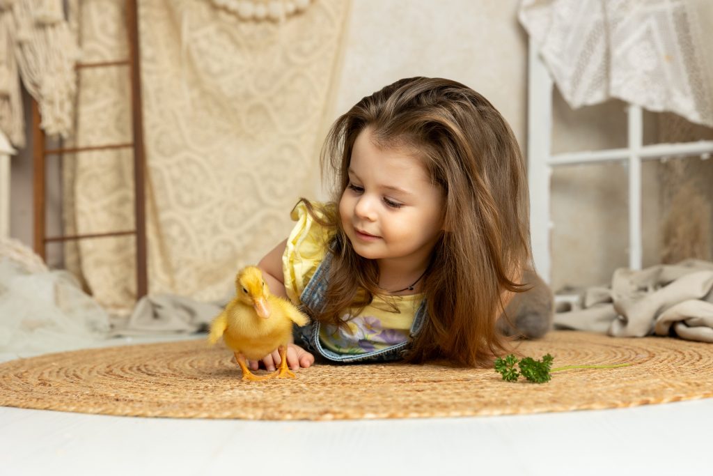
Bright colors bring energy and personality. They’re perfect for creating memorable, high-impact images that stand out on social media or in portfolios.
The downside? They can be difficult to control. Oversaturation, color cast, and harsh contrast are common issues if lighting and styling aren’t handled carefully.
Pastels thrive in soft, diffused lighting. They reflect light evenly, enhancing that bright and airy look.
Bright colors, on the other hand, can become even more intense under strong lighting. This requires careful exposure control to avoid losing detail.
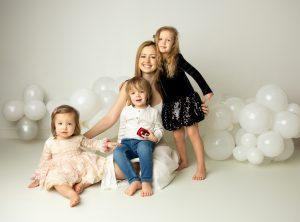
When it comes to family photography, maternity shoots, and lifestyle sessions, soft pastels almost always come out on top—and there’s a good reason for that. These types of sessions are built around emotion, connection, and storytelling. You’re not just capturing how people look; you’re capturing how they feel together. And pastels naturally support that.
Soft tones like blush, cream, sage, and powder blue create a calm, inviting atmosphere. They don’t distract from the subjects—they enhance them. In a studio setting, where everything is controlled, this becomes even more important. The last thing you want is for clothing or background colors to overpower a tender moment between a parent and child or an expecting mother.
Another big advantage is how forgiving pastels are across different skin tones and lighting setups. Whether you’re working with soft window light or studio strobes, these colors remain consistent and flattering. That’s why they’re so widely used in spring family photoshoots and maternity studio photography.
That said, it doesn’t mean bright colors are completely off-limits. You can still incorporate them as subtle accents—maybe a small detail in an outfit or a prop—but they shouldn’t dominate the frame if your goal is softness and emotion.
Now, flip the script. If you’re shooting personal branding photos, fashion portraits, or creative editorial work, bright colors can be exactly what you need. These sessions are less about subtle emotion and more about personality, energy, and visual impact.
A bold color palette can help communicate confidence, creativity, and individuality. For example, a vibrant yellow backdrop paired with a strong pose can instantly create a high-energy, modern look. This is especially effective for entrepreneurs, influencers, or anyone building a visual brand.
In 2026, many photographers are blending both approaches—using a mostly neutral or pastel base with one or two bold elements to create contrast. This keeps the image visually interesting without overwhelming it.
Styling with pastels is all about balance and softness. Start with a cohesive palette—something like cream, dusty pink, and soft blue—and build outfits around those tones. The key is to keep everything within a similar intensity level so nothing feels out of place.
Layering works beautifully here. A light cardigan, a flowy dress, or a textured knit can add dimension without disrupting the color harmony. This is especially helpful in studio settings where the environment is minimal.
Also, don’t forget about texture. Since pastel colors are subtle, texture becomes the element that adds depth. Linen, cotton, and soft knits are perfect choices because they interact gently with light.
This approach aligns perfectly with popular searches like what to wear for spring photoshoot and pastel outfit ideas for family pictures, making it both practical and SEO-friendly.
When working with bright colors, restraint is everything. It’s easy to go too far and end up with an image that feels chaotic instead of intentional.
A good rule of thumb? Let one element be the star. If someone is wearing a bold outfit, keep the background neutral. If you’re using a bright backdrop, tone down the wardrobe. This creates a visual hierarchy that feels clean and controlled.
You can also use color blocking—pairing one bold color with a neutral tone—to create a modern, editorial look. For example, a vibrant blue outfit against a soft beige background can feel striking without being overwhelming.
You don’t have to choose one or the other. In fact, some of the most interesting spring studio photoshoots combine both soft pastels and bright colors in a balanced way.
The trick is to establish a dominant palette and then introduce contrast. For example, you might build your scene around soft neutrals and pastels, then add a single bold element—a bright accessory, a statement piece of clothing, or even a subtle pop in the background.
This creates visual interest while maintaining harmony. The image still feels cohesive, but it has a bit more personality and depth.
Think of bright colors as accents rather than the foundation—unless your concept specifically calls for boldness. Accent colors draw the eye and create focal points, while pastels provide the base that keeps everything grounded.
This approach is widely used in modern studio photography trends 2026, where photographers aim to balance creativity with timeless appeal. It allows you to experiment without risking a look that might feel dated too quickly.
Choosing between soft pastels vs bright colors for your spring studio session isn’t about which one is better—it’s about what story you want to tell. Pastels offer softness, elegance, and timeless appeal, making them perfect for emotional, connection-focused sessions. Bright colors bring energy, personality, and bold visual impact, making them ideal for creative and branding work.
The real magic happens when you understand how to use each intentionally. By considering lighting, styling, and the purpose of your shoot, you can create images that feel not only beautiful but also meaningful and well thought out.
At the end of the day, color isn’t just a detail—it’s the foundation of your visual story.