- Category
- Knowledge Base
Date12 June 2026
Date9 April 2026
Color isn’t just a visual choice—it’s emotional. The tones you choose for a spring studio photoshoot directly influence how the image feels to the viewer. Soft, warm hues can evoke calmness and comfort, while cooler tones might feel fresh, clean, and modern. That’s why understanding color psychology in photography is such a powerful tool, especially in a controlled studio environment.
In 2026, the shift is clear: people are moving away from overly bright, artificial-looking palettes and leaning into colors that feel grounded and natural. This aligns with broader lifestyle trends—wellness, minimalism, and authenticity are shaping visual preferences across industries, including photography.
For example, warm neutrals like sand and cream create a sense of stability and warmth, making them perfect for family portraits. Meanwhile, muted greens and soft blues tap into nature, which subconsciously signals calm and renewal—exactly what spring is all about.
When you choose colors intentionally, you’re not just styling a shoot—you’re shaping the emotional narrative of the image. That’s why keywords like best colors for photoshoots, spring color palette photography, and studio photography color ideas continue to trend. People aren’t just looking for what looks good—they’re looking for what feels right.
Here’s something a lot of beginners overlook: your camera doesn’t see color the same way your eyes do. Certain tones can appear more saturated, washed out, or even slightly shifted depending on lighting and camera settings. That’s why some colors that look amazing in real life don’t always translate well on camera.
For example, highly saturated colors can “bleed” or lose detail, especially under strong studio lighting. On the other hand, very pale tones can sometimes appear flat if there isn’t enough contrast or texture.
Modern camera sensors in 2026 are better than ever, with improved dynamic range and color accuracy, but they still respond best to balanced, mid-range tones. This is one reason why muted and earthy palettes are dominating current trends—they’re easier to capture accurately and require less correction in post-processing.
Understanding this technical side of color helps you make smarter choices during planning. Instead of relying on trial and error, you can build palettes that are designed to look great both in real life and on camera.
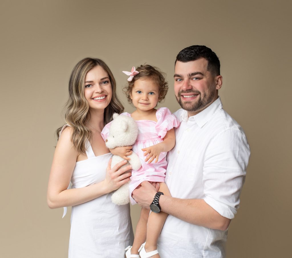
Neutrals are having a major moment in 2026—but not the flat, boring kind. We’re talking about elevated neutrals with warmth and depth. Shades like creamy ivory, soft beige, and warm sand are dominating studio photography trends because they’re incredibly versatile and timeless.
These tones work beautifully in a studio because they reflect light rather than absorb it. This helps create that bright, airy look that’s so popular in spring sessions. They also act as a perfect base, allowing other colors—or the subjects themselves—to stand out without distraction.
From a styling perspective, neutrals make coordination easy. Families can mix and match shades without worrying about clashing, and the overall result feels cohesive and polished.
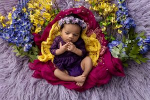
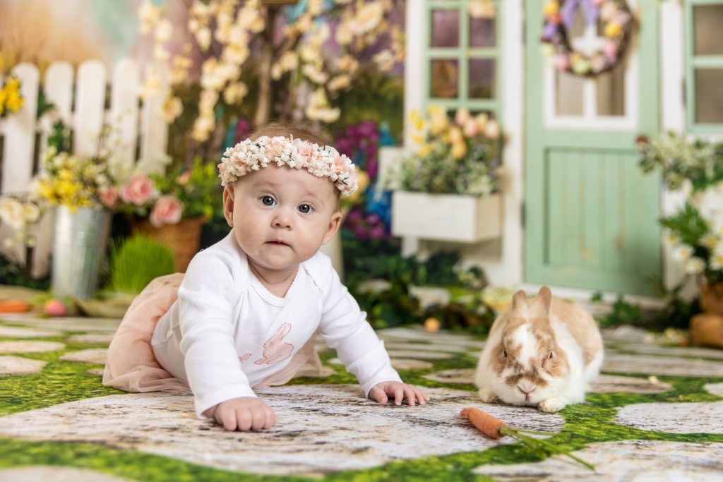
Pastels aren’t going anywhere—but they’re evolving. In 2026, the trend is shifting toward dusty pastels—muted versions of traditional spring colors that feel more sophisticated and less “Easter-themed.”
Think dusty rose instead of bright pink, or muted lavender instead of vibrant purple. These tones still carry that light, springtime energy, but they’re easier on the eyes and more flattering on camera.
They also pair beautifully with neutrals, creating layered, visually interesting compositions without overwhelming the frame.
Green is one of the most versatile colors in photography, and in 2026, it’s all about muted, earthy greens. Sage, olive, and moss tones are especially popular because they feel organic and calming.
These colors work well across different skin tones and lighting setups, making them a safe yet stylish choice for studio portraits. They also connect subtly to nature without requiring literal elements like plants or flowers.
Soft blues are making a strong comeback, especially in light and airy photography. Powder blue, in particular, has become a go-to shade for spring shoots because it adds a sense of openness and calm.
It pairs well with whites, creams, and even muted greens, making it a versatile addition to any color palette. On camera, it maintains its tone without oversaturating, which is a huge advantage.
If your goal is to create bright, clean images, you need colors that work with your lighting—not against it. Light-reflective tones like cream, soft gray, and pale pastels help bounce light around the frame, enhancing the overall brightness.
These colors also reduce harsh shadows and create a more even exposure, which is ideal for studio photography.
Oversaturated colors can cause a range of problems—from color bleeding to unwanted casts on skin tones. For example, a bright red outfit might reflect onto the subject’s face, creating an unnatural look.
That’s why muted tones are preferred. They’re easier to control and require less correction during editing.
Lighting can completely change how a color appears. Natural light tends to be softer and more neutral, while artificial light can introduce warmth or coolness depending on the setup.
Understanding this helps you choose colors that will look consistent across different lighting conditions.
Getting your white balance right is crucial for maintaining accurate colors. Even the best palette can look off if your white balance is incorrect.
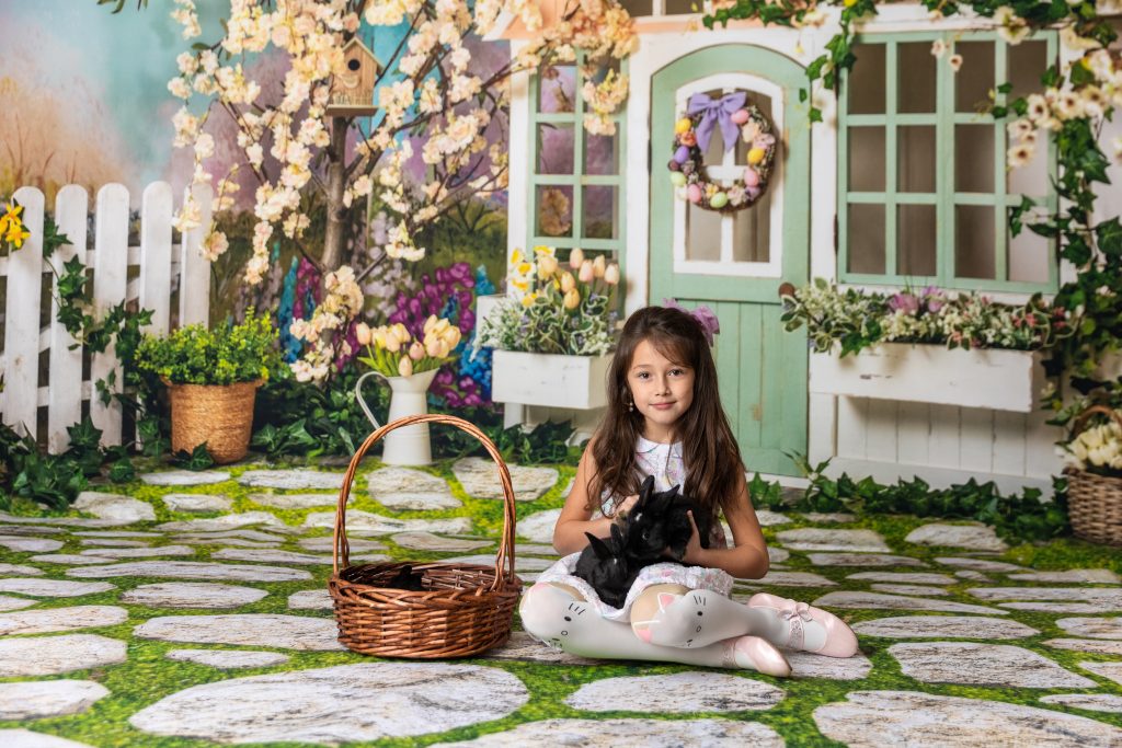
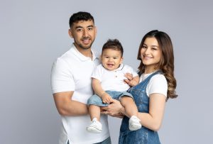
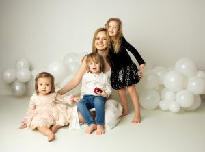
One of the biggest shifts in spring color trends for studio photoshoots in 2026 is how families approach outfit coordination. The old-school idea of everyone wearing identical white shirts and jeans? That’s officially outdated. Today, it’s all about coordinated color palettes that feel natural, effortless, and visually balanced.
Instead of matching, think in terms of a shared color story. Start with 3–5 tones from the same palette—like cream, sage green, dusty blue, and soft beige—and let each person wear a variation of those shades. This creates harmony without making the image feel stiff or overly styled.
What makes this approach so effective is that it adds dimension. When everyone wears slightly different tones and textures, the image feels layered and alive. For example, one person might wear a chunky knit sweater in cream, while another wears a flowy sage dress. Same palette, totally different textures—and that’s what makes it visually interesting.
Professional photographers often guide clients with mood boards or sample palettes because this step can make or break the final result. According to industry trends shared on platforms like The Knot and Shotkit, coordinated (not matching) outfits are among the most requested styling approaches for family studio photography in recent years.
Color alone isn’t enough—you need texture to bring it to life. In fact, one of the defining features of 2026 studio photography trends is the intentional use of fabric and material to enhance color palettes.
Soft textures like linen, cotton, wool, and chiffon work especially well because they interact with light in a subtle, flattering way. They add depth without creating harsh contrasts, which is essential for maintaining that light and airy spring look.
Imagine a setup where everyone is dressed in muted tones, but the textures vary—flowy dresses, soft knits, light denim, maybe even a slightly structured blazer. Suddenly, the image feels dynamic without being busy.
This is also where layering comes into play. A light cardigan, an open shirt, or a scarf can add movement and dimension, especially when captured in candid moments. These small details might seem insignificant, but on camera, they make a noticeable difference.
When it comes to studio backdrop trends in 2026, less is definitely more. Minimalist backdrops in neutral tones continue to dominate—and for good reason. They’re versatile, timeless, and incredibly effective at keeping the focus where it belongs: on the subject.
Shades like off-white, warm beige, soft gray, and even very light taupe are widely used in modern studios. These colors reflect light beautifully, helping to maintain a bright and clean aesthetic. They also pair effortlessly with trending wardrobe colors, making styling much easier.
Another advantage? Neutral backdrops age well. While bold or trendy backgrounds might feel exciting in the moment, they can quickly look dated. Neutrals, on the other hand, remain relevant year after year, which is exactly what clients want when investing in professional family portraits.
If you want something a bit more creative without losing that light and airy feel, gradient and hand-painted backdrops are becoming increasingly popular in 2026.
These backdrops typically feature soft transitions between tones—like cream fading into pale blue, or beige blending into a warm gray. The effect is subtle but powerful. It adds depth and visual interest without overwhelming the image.
Hand-painted backdrops, especially those with a slightly textured finish, can also elevate a photoshoot. They bring an artistic, almost editorial quality to the image while still maintaining that soft, spring-inspired vibe.
This trend aligns with the growing demand for custom, high-end studio photography experiences, where clients are looking for something unique but still timeless.
Let’s talk about what doesn’t work—because avoiding the wrong colors is just as important as choosing the right ones.
Neon colors are one of the biggest no-gos for spring studio photoshoots. They’re слишком intense, reflect poorly on skin tones, and often create unwanted color casts. Even with advanced editing tools, they’re difficult to balance.
Heavy dark tones—like deep black, dark burgundy, or navy—can also feel out of place in a spring setting. They absorb light, making the image feel heavier and less vibrant. While they can work in certain contexts, they generally clash with the light and airy aesthetic that defines modern spring photography.
Another mistake? Chasing trends that don’t have staying power. Every year brings a few “it” colors that flood social media, but not all of them translate well into timeless photography.
For example, ultra-specific shades that dominate fashion for a single season might look dated just a year later. That’s why many professional photographers recommend blending trends with classic tones—using trendy colors as accents rather than the foundation of your palette.
This approach ensures your photos still feel fresh today, but won’t feel outdated tomorrow.
If you’re a photographer—or even just someone planning multiple sessions—developing a signature color style can set your work apart. In 2026, consistency is a huge part of branding, especially in visual industries.
This doesn’t mean using the exact same colors every time. Instead, it’s about working within a recognizable range—maybe you lean toward warm neutrals and dusty tones, or soft cool palettes with blues and greens. Over time, this becomes part of your visual identity.
Clients often choose photographers based on this consistency. They’re not just booking a session—they’re buying into a specific aesthetic.
Here’s the sweet spot: combining what’s current with what lasts. Use spring color trends 2026 as inspiration, but anchor your palette in timeless tones.
For example, you might incorporate a trending shade like powder blue, but pair it with classic neutrals like cream and beige. This keeps the image feeling modern without risking it looking dated in a few years.
Experienced photographers often follow a 70/30 rule—70% timeless, 30% trendy. It’s a simple guideline, but it works.
The spring color trends for studio photoshoots in 2026 are all about subtlety, balance, and intention. Instead of bold, overpowering palettes, the focus has shifted toward soft, natural tones that enhance light and emotion.
From elevated neutrals and dusty pastels to muted greens and airy blues, the colors that work best on camera are the ones that support the subject—not compete with it. When combined with thoughtful styling, proper lighting, and a clear creative vision, these palettes can transform a simple studio session into something truly memorable.
At the end of the day, it’s not just about following trends—it’s about understanding why they work and how to adapt them to your own style.