- Category
- Knowledge Base
Date12 June 2026
Date17 March 2026
Family portraits are about more than just capturing faces in front of a camera. They tell a story about connection, personality, and the relationships between family members. While expressions and composition play a major role in creating meaningful photographs, color is another powerful element that shapes the mood of an image.
Colors influence how a photograph feels. They can make an image appear warm and inviting, calm and elegant, or bright and energetic. In family photography, thoughtful color choices often make the difference between a photo that simply looks nice and one that feels emotionally engaging.
A professional photographer in Philadelphia often considers color as part of the creative process when planning a session. From wardrobe choices to background selection and lighting, every element contributes to the overall mood of the portrait.
Families planning a photoshoot in Philadelphia frequently ask what colors they should wear or how to coordinate outfits. Understanding how color works in photography can help families choose combinations that enhance the emotional tone of their portraits.
When used thoughtfully, color becomes a subtle but powerful storytelling tool.
Color plays a unique role in how viewers perceive an image. Even before someone notices facial expressions or composition, color sets the emotional tone of the photograph.
Warm colors often create a sense of comfort and energy, while cooler tones can evoke calmness and balance. Neutral shades can add elegance and timelessness.
An experienced photographer in Philadelphia often guides families in choosing colors that complement both their personalities and the environment where the photos will be taken.
Families preparing for a photoshoot in Philadelphia may initially focus on matching outfits, but successful portraits usually rely more on coordination rather than identical clothing.
Colors should work together harmoniously rather than compete for attention.
When color palettes are balanced, the viewer’s attention naturally shifts to the people in the photograph instead of the clothing itself.
This balance helps create portraits that feel cohesive and visually pleasing.
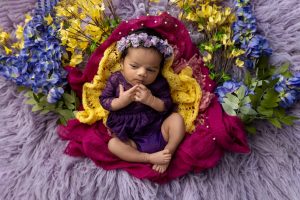
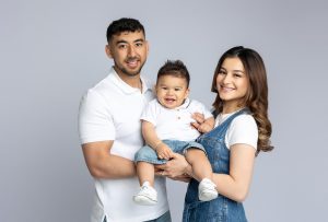
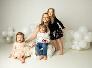
Neutral tones are among the most popular choices for family portraits, especially in studio settings. Colors such as beige, cream, soft gray, and muted earth tones create a calm and sophisticated look.
These colors work well because they do not distract from the subjects. Instead, they help highlight facial expressions and natural interactions.
A skilled photographer in Philadelphia often recommends neutral color palettes for families who want portraits that remain timeless for years to come.
Families booking a photoshoot in Philadelphia may find that soft neutrals also photograph beautifully under studio lighting.
These tones reflect light gently and create smooth transitions between highlights and shadows.
Neutral colors also make it easier to coordinate outfits among multiple family members.
By keeping the palette simple, the focus remains on connection rather than clothing.
Warm tones such as soft reds, warm browns, terracotta, and golden hues can add energy and warmth to family portraits.
These colors often evoke feelings of comfort, happiness, and closeness.
A professional photographer in Philadelphia might suggest incorporating warm tones during sessions designed to feel lively and expressive.
Families planning a photoshoot in Philadelphia sometimes choose these colors for autumn sessions or indoor portraits with cozy styling.
Warm colors tend to draw attention and create a welcoming atmosphere within the photograph.
When used thoughtfully, they can enhance the emotional warmth between family members.
However, it is important to balance these tones carefully so they do not overwhelm the image.
Subtle variations of warm colors usually work best.
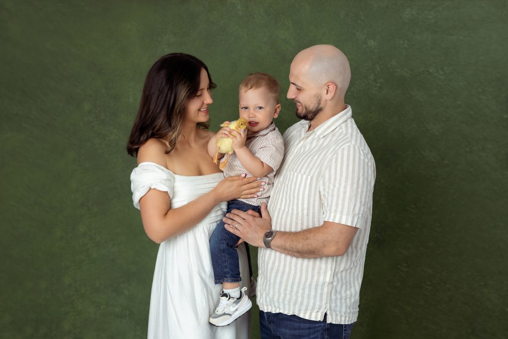
Cool colors such as soft blues, sage greens, and gentle lavender tones can create a calm and peaceful mood in family portraits.
These colors are often associated with relaxation and balance, making them ideal for portraits that emphasize quiet connection and intimacy.
A thoughtful photographer in Philadelphia may recommend cool tones for families who prefer a refined and understated style.
Clients scheduling a photoshoot in Philadelphia often choose cool palettes when they want portraits that feel modern and sophisticated.
These tones work particularly well in minimalist studio settings or outdoor locations with natural greenery.
Cool colors can also help create a harmonious visual flow throughout the image.
When paired with soft lighting and simple backgrounds, they contribute to a serene and elegant atmosphere.
One common misconception in family photography is that everyone should wear exactly the same color. While matching outfits may seem organized, they can sometimes make the image look stiff or unnatural.
Instead, many photographers recommend coordinating colors within a shared palette.
A professional photographer in Philadelphia often encourages families to choose two or three complementary colors and vary them across outfits.
Families preparing for a photoshoot in Philadelphia might select a palette such as cream, soft blue, and light gray, allowing each family member to wear a different combination of those tones.
This approach creates visual variety while maintaining harmony within the photograph.
Textures and layers can also add depth without introducing new colors.
The goal is to create balance while allowing each person’s style to feel natural.
Color in photography is closely connected to lighting. Even the most carefully chosen outfits can appear different depending on how the scene is lit.
A skilled photographer in Philadelphia understands how lighting influences color tones and adjusts the setup accordingly.
During a photoshoot in Philadelphia, photographers often use soft lighting techniques to ensure that colors appear natural and flattering.
This approach prevents overly harsh shadows and keeps skin tones balanced.
Lighting can also emphasize certain colors within the image, making them appear richer or more subtle.
When color choices and lighting work together, the final result feels cohesive and visually harmonious.
Color is one of the most powerful tools in family portrait photography. It shapes the emotional tone of the image, influences how viewers experience the photograph, and helps create a cohesive visual story.
From soft neutral palettes to warm and energetic tones or calm cool shades, each color choice contributes to the overall mood of the portrait.
An experienced photographer in Philadelphia understands how to guide families in selecting colors that enhance their images while keeping the focus on genuine connection.
For families planning a photoshoot in Philadelphia, thoughtful color coordination can make portraits feel more natural, timeless, and visually balanced.
When simplicity and color work together, family portraits become more than photographs—they become lasting memories captured with intention and care.